How much Rainfall did Puerto Rico had in the last 15 years
Portfolio
DataViz
Assignment
Author
Geraline Tross-Torres
Published
May 3, 2024
Preamble
Let’s learn more about the rain patterns across Puerto Rico. Over the years, we had different patterns of rain, which depend on the season; for example, during hurricane and tropical seasons, we will have more rainfall than in years when there are no storms, and we can also see when we have drought season.
How can we get this information? The NOAA has stations across the island that measure the amount of rain accumulated around each station. We can display that data on a spatial map and visualize the amount of rain accumulated between stations.
In this post, we look at 15 years of rainfall data. I will provide details on how I got to my final finished map visualization and what information we can obtain from it.
Data
The rain data was acquired by the database of the National Centers for Environmental Information - National Oceanic and Atmospheric Administration (NCEI - NOAA). https://www.ncei.noaa.gov/access/search/data-search/daily-summaries
The NCEI-NOAA provides large data sets of integrated daily climate observations through time, such as rain, snow, hail, temperature, etc. The data set that I am working on is how much rain we had in different years in Puerto Rico. The following Data Table provides the data I used to visualize my map. I also provided a Data Dictionary to help you interpret the Data Table.
Data Dictionary
Code
DataDic <-read_xlsx("data dic.xlsx")# Assuming you want to select only the first 10 columns from DataTable# Displaying the selected columns using knitr::kable()knitr::kable(head(DataDic))
Variable
Description
Data Type
Station
26 NOAA Stations
Character
Latitde
Coordinates
Numeric
Longitude
Coordinates
Numeric
Elevation
Coordinates
Numeric
Name
Name of the station’s location
Character
Month
Months 1 - 12 (January - Decemner)
Numeric
Data Table
Code
DataTable <-read_xlsx("geraline_data_mm.xlsx")# Assuming you want to select only the first 10 columns from DataTableselected_columns <- DataTable[, 1:10]# Displaying the selected columns using knitr::kable()knitr::kable(head(selected_columns))
STATION
LATITUDE
LONGITUDE
ELEVATION
NAME
MONTH
2009
2010
2011
2012
RQC00660061
18.17470
-66.79770
557.8
ADJUNTAS SUBSTATION, PR US
1
23.03226
39.93548
18.000000
36.645161
RQC00660152
17.95550
-66.22220
7.6
AGUIRRE, PR US
1
23.87097
39.67742
7.677419
4.666667
RQC00660158
18.12800
-66.26410
710.2
AIBONITO 1 S, PR US
1
44.77419
65.03226
30.193548
24.400000
RQC00660426
18.34940
-66.75250
323.1
ARECIBO OBSERVATORY, PR US
1
49.74194
170.45161
25.741936
84.451613
RQC00661345
18.47240
-67.11550
85.0
CALERO CAMP, PR US
1
28.06452
45.29032
29.096774
70.064516
RQC00663023
18.08425
-66.65464
198.1
CORRAL VIEJO, PR US
1
35.80645
28.51613
14.928571
34.153846
Code
library(dplyr)# Read the datarainfallprwide <-read_excel('geraline_data_mm.xlsx')# Extract years from column namesyears <-as.character(2009:2023)# Convert the numeric columns to numeric typerainfallprwide[,-(1:5)] <-lapply(rainfallprwide[,-(1:5)], as.numeric)# Calculate total rainfall for each station for each year individuallystation_year_total_rainfall <- rainfallprwide %>%group_by(STATION, LATITUDE, LONGITUDE, NAME) %>%summarise(across(all_of(years), ~sum(.x, na.rm =TRUE), .names ="Total_Rainfall_{.col}"))
Visualizations
The following visualizations show how I incorporated the rainfall data into a ggplot and Plotly to make the map interactive.
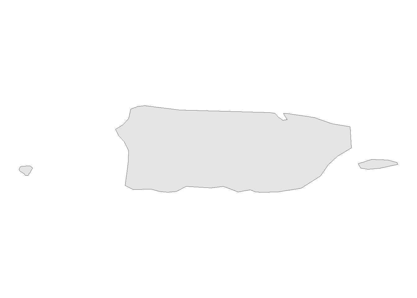
Base Map of Puerto Rico
This is just a base map of Puerto Rico. I was searching for a simple map that would help me incorporate the different NOAA stations so that I could later add the actual rainfall data.
Code
# Get the spatial data for countriescountries <-ne_countries(scale ="medium", returnclass ="sf")# Filter the dataset to extract Puerto Ricopuerto_rico <-subset(countries, admin =="Puerto Rico")# Plot Puerto Rico's geometryggplot() +geom_sf(data = puerto_rico) +theme_void()
Figure 1: Base Map of Puerto Rico. This is just a plot of Puerto Rico’s geometry of how the island looks like
Can you see Puerto Rico?
I mentioned before that I wanted to use Plotly to have an interactive map; basically, I wanted to hover over the stations, and their names would come up and zoom in and out, but it was more complex than I thought.
First, I couldn’t get an interactive map with just Puerto Rico. I had to find another projection and add the latitude and longitude coordinates so the map could be centered on Puerto Rico. However, I used the Mercator projection, and it was hard to see Puerto Rico.
Can you zoom in and see where Puerto Rico is?
Once you are zoomed in, you can see Puerto Rico and the 26 NOAA stations. You can hover over them to see their names. I added the stations to the map due to their latitude and longitude coordinates.
Figure 2: Plotly Interaction Map of Puerto Rico. Zooming into Puerto Rico, there are 26 NOAA stations, and you can hover over them to see their names. I added the stations to the map due to their latitude and longitude coordinates.
Is the quality of the visualization good?
So, I have Puerto Rico and its stations, but there are too many steps just to get to the map, and the quality of the map is not good, so I had to take another approach.
Combination of ggplot Base Map + Plotly
In the beginning, I showed you the base map of Puerto Rico from ggplot, so why not combine the base map from ggplot and apply it to Plotly? After many tries and errors, I finally got it to work.
Now you can see the map more clearly and have the Plotly interaction to hover over the stations and see their names. Basically, it’s a better version of visualization compared to the previous one.
Code
# Get the map data for Puerto Ricomap_data <-map_data("world", region ="Puerto Rico")# Create the base map with ggplot2base_map <-ggplot() +geom_polygon(data = map_data, aes(x = long, y = lat, group = group), fill ="lightgray", color ="black") +coord_map() +ggtitle("NOAA Stations - Puerto Rico") +theme(plot.title =element_text(hjust =0.5), # Centering titleaxis.title.x =element_text(size =12, face ="bold", color ="black"), # Customizing x-axis labelaxis.title.y =element_text(size =12, face ="bold", color ="black")) # Customizing y-axis label# Convert the base map to a Plotly objectplotly_map <-ggplotly(base_map)# Assuming 'stations' is your data frame and it has columns 'LATITUDE', 'LONGITUDE', and 'NAME'# Add station markers to the Plotly map plotly_map %>%add_markers(data = stations,x =~LONGITUDE,y =~LATITUDE,text =~NAME,marker =list(symbol ="circle", # Change the symbol to squarecolor ="navy", # Change the color to bluesize =10# Change the size to 10 ),hoverinfo ="text" )
Figure 3: Plotly Interaction Base Map of Puerto Rico. Have a crisper visualization so that you can better see the stations located around the island.
Applying Rainfall Data of January 2009
Now that I have a better visualization of the NOAA stations, I can apply rainfall data and see how much rain is accumulated around the stations that are located in different parts of the island. For my first intent in doing this, I only added the data of the month of January of 2009, and then see what the visualization looks like.
Code
#2009# Read the datarainfallprwide <-read_excel('geraline_data_mm.xlsx')# Create the stations data frame and filter for month 1stations_rain <- rainfallprwide %>%filter(MONTH ==1) %>%select(STATION, LATITUDE, LONGITUDE, NAME, MONTH, "2009") %>%unique()# Extract years from column namesyears <-as.character(2009:2023)# Convert the numeric columns to numeric typerainfallprwide[,-(1:5)] <-lapply(rainfallprwide[,-(1:5)], as.numeric)# Calculate total rainfall for each station for each year individuallystation_year_total_rainfall <- rainfallprwide %>%group_by(STATION, LATITUDE, LONGITUDE, NAME) %>%summarise(across(all_of(years), ~sum(.x, na.rm =TRUE), .names ="Total_Rainfall_{.col}"))base_map_2 <-ggplot() +geom_polygon(data = map_data, aes(x = long, y = lat, group = group), fill ="lightgray", color ="black") +coord_map() +ggtitle("Rainfall for January 2009") +theme(plot.title =element_text(hjust =0.5), # Centering titleaxis.title.x =element_text(size =12, face ="bold", color ="black"), # Customizing x-axis labelaxis.title.y =element_text(size =12, face ="bold", color ="black")) # Customizing y-axis label# Convert the base map to a Plotly objectplotly_map <-ggplotly(base_map_2)# Assuming 'stations_rain' is your data frame and it has columns 'LATITUDE', 'LONGITUDE', 'NAME', and '2009'# Add station markers to the Plotly map with size based on rainfall in 2009 plotly_map %>%add_markers(data = station_year_total_rainfall,x =~LONGITUDE,y =~LATITUDE,text =~NAME,marker =list(symbol ="circle", # Change the symbol to squarecolor =~Total_Rainfall_2009 /100, # Change the color to bluesize =~Total_Rainfall_2009 /100,colorscale ="Blues",reversescale =TRUE# Size based on rainfall in 2009 ),hoverinfo ="text" )
Figure 4: Rainfall for January 2009. Here’s a summary of the rainfall we had in January 2009. Each station recorded a different amount of rain due to its location and topography.
In this visualization, we identified the stations in shapes, such as circles. The different color schemes represent the amount of rain measured on that station; lighter blue means less rain, and darker blue means more rain; we used this color pattern to get an idea of the different patterns of rain across stations. I also used the change in the size of the circle as another channel to help visualize the amount of rain on each station and not just only have the change of color scheme.
15 years of Rainfall in Puerto Rico
Now that I can better visualize the NOAA stations with data on accumulated rain, I want to portray my whole data set of 15 years of Raibfall in Puerto Rico. But first, I calculated the total amount of rain each year and displayed it in my map visualization. Instead of having individual maps portraying the data, I wanted the maps adjacent to each to be easy to compare and contrast how much rain we had in the last 15 years.
Code
base_map_3 <-ggplot() +geom_polygon(data = map_data, aes(x = long, y = lat, group = group), fill ="lightgray", color ="black") +coord_map() +ggtitle("15 Years of RainFall in Puerto Rico") +theme(plot.title =element_text(hjust =0.5), # Centering titleaxis.title.x =element_text(size =12, face ="bold", color ="black"), # Customizing x-axis labelaxis.title.y =element_text(size =12, face ="bold", color ="black")) # Customizing y-axis label# Create an empty list to store the plotsplot_list <-list()# Loop over each yearfor (year in2009:2023) {# Create a map for the current year plot <-ggplotly(base_map_3) %>%add_markers(data = station_year_total_rainfall,x =~LONGITUDE,y =~LATITUDE,text =~NAME,marker =list(symbol ="circle",color = station_year_total_rainfall[[paste0("Total_Rainfall_", year)]] /100,size = station_year_total_rainfall[[paste0("Total_Rainfall_", year)]] /100,colorscale ="Blues",reversescale =TRUE ),hoverinfo ="text" )# Add the plot to the list plot_list[[year -2008]] <- plot}# Arrange the plots in a gridsubplot(plot_list, nrows =5)
Figure 5: 15 Years of RainFall in Puerto Rico.Here’s a summary of the rainfall we had in the last 15 years. Each station recorded a different amount of rain due to its location and topography.
As you can see, each year has different rainfall patterns, but we also need to consider the Hurricane and Tropical seasons, which change the rain pattern over the years. By looking at this data visualization, you can compare which years had more rain, storms, or a dry season. It gives you a perspective on how to perceive, in this case, the amount of rain we had in different years. Since I am still using Plotly, you can still use the interactive of zoom in and out and hover over the station’s names. This last visualization upheld my expectations; even though we can add improvements in the labeling, which year each map, it is something I can improve later. I am proud that I managed to make this last visualization.
Summary
For this final project, I wanted to get out of my comfort zone and learn a new type of visualization, and I was doing Spatial Maps. I always wondered how you could portray data into a map for visualization, for example, the number of cases of diseases across different states in the U.S. or, in this case, how much rain was measured at different time periods. That was when I got the idea that I wanted to try this and see if I could make something of it.
So, as a recap, over the years, we had different patterns of rain, which depend on the season. With the NOAA’s data, I portrayed that data on a spatial map of Puerto Rico and visualized the amount of rain accumulated between stations. I looked into 15 years of rainfall data, and I can say that across these past 15 years, we had different patterns of rain; in some years, we had less rain and more of a dry season, and in some years, we had more rain and looking at the history data, one can determine that there was a tropical storm or hurricane involved and that’s why we got more rainfall that a “normal” year without storms. This can also help us in the sense of climate change if we have more storms or more rain patterns or if we are having more dry seasons. You can obtain much information by looking at this data; you need to know what you want.
This project was interesting to work with. There were a lot of ups and downs in getting it down, but I finally got what I wanted to portray. The data I wanted to look at has an animation visualization in which you have a time bar and change through time and, on a single map in a 3D pattern, see the changes in rainfall across time; that would have been cool to see.
Source Code
---title: "BCB 520 - FINAL PROJECT"subtitle: "Let's get into Rainfall Data of Puerto Rico"format: html: toc: false echo: trueauthor: "Geraline Tross-Torres"date: "2024-05-03"categories: [Portfolio, DataViz, Assignment]image: "RainFall.png"description: "How much Rainfall did Puerto Rico had in the last 15 years"code-fold: truecode-tools: trueexecute: warning: False---## PreambleLet's learn more about the rain patterns across Puerto Rico. Over the years, we had different patterns of rain, which depend on the season; for example, during hurricane and tropical seasons, we will have more rainfall than in years when there are no storms, and we can also see when we have drought season. How can we get this information? The NOAA has stations across the island that measure the amount of rain accumulated around each station. We can display that data on a spatial map and visualize the amount of rain accumulated between stations.In this post, we look at 15 years of rainfall data. I will provide details on how I got to my final finished map visualization and what information we can obtain from it.## Data```{r, include=FALSE}library(ggplot2)library(sf)library(tigris)library(dplyr)library(rnaturalearth)library(rnaturalearthdata)library(dplyr)library(rnaturalearthhires)library(plotly)library(readxl)library(dplyr)library (knitr)library(plotly)library(maps)library(tidyverse)```The rain data was acquired by the database of the **National Centers for Environmental Information - National Oceanic and Atmospheric Administration (NCEI - NOAA)**. https://www.ncei.noaa.gov/access/search/data-search/daily-summariesThe NCEI-NOAA provides large data sets of integrated daily climate observations through time, such as rain, snow, hail, temperature, etc. The data set that I am working on is how much rain we had in different years in Puerto Rico. The following **Data Table** provides the data I used to visualize my map. I also provided a **Data Dictionary** to help you interpret the Data Table. ### Data Dictionary```{r}DataDic <-read_xlsx("data dic.xlsx")# Assuming you want to select only the first 10 columns from DataTable# Displaying the selected columns using knitr::kable()knitr::kable(head(DataDic))```### Data Table```{r}DataTable <-read_xlsx("geraline_data_mm.xlsx")# Assuming you want to select only the first 10 columns from DataTableselected_columns <- DataTable[, 1:10]# Displaying the selected columns using knitr::kable()knitr::kable(head(selected_columns))``````{r}library(dplyr)# Read the datarainfallprwide <-read_excel('geraline_data_mm.xlsx')# Extract years from column namesyears <-as.character(2009:2023)# Convert the numeric columns to numeric typerainfallprwide[,-(1:5)] <-lapply(rainfallprwide[,-(1:5)], as.numeric)# Calculate total rainfall for each station for each year individuallystation_year_total_rainfall <- rainfallprwide %>%group_by(STATION, LATITUDE, LONGITUDE, NAME) %>%summarise(across(all_of(years), ~sum(.x, na.rm =TRUE), .names ="Total_Rainfall_{.col}"))```## VisualizationsThe following visualizations show how I incorporated the rainfall data into a ggplot and Plotly to make the map interactive. ### Base Map of Puerto RicoThis is just a base map of Puerto Rico. I was searching for a simple map that would help me incorporate the different NOAA stations so that I could later add the actual rainfall data. ```{r}# Get the spatial data for countriescountries <-ne_countries(scale ="medium", returnclass ="sf")# Filter the dataset to extract Puerto Ricopuerto_rico <-subset(countries, admin =="Puerto Rico")# Plot Puerto Rico's geometryggplot() +geom_sf(data = puerto_rico) +theme_void()```**Figure 1:** Base Map of Puerto Rico. This is just a plot of Puerto Rico's geometry of how the island looks like### Can you see Puerto Rico?I mentioned before that I wanted to use Plotly to have an interactive map; basically, I wanted to hover over the stations, and their names would come up and zoom in and out, but it was more complex than I thought.First, I couldn't get an interactive map with just Puerto Rico. I had to find another projection and add the latitude and longitude coordinates so the map could be centered on Puerto Rico. However, I used the **Mercator projection**, and it was hard to see Puerto Rico.**Can you zoom in and see where Puerto Rico is?**Once you are zoomed in, you can see Puerto Rico and the 26 NOAA stations. You can hover over them to see their names. I added the stations to the map due to their latitude and longitude coordinates.```{r}# Read the datarainfallprwide <-read_excel('geraline_data_mm.xlsx')stations <- rainfallprwide %>%select(STATION, LATITUDE, LONGITUDE, NAME)%>%unique()g <-list(scope ='north america',center =list(lat =18.2208, lon =-66.5901), # Centered on Puerto Ricoprojection =list(type ='mercator'),showland =TRUE,landcolor ="rgb(220, 220, 220)", # Light graysubunitcolor ="rgb(200, 200, 200)", # Light graycountrycolor ="rgb(200, 200, 200)", # Light graycountrywidth =0.5,subunitwidth =0.5)plot_geo(stations, lat =~LATITUDE, lon =~LONGITUDE) %>%add_markers(text =~NAME,symbol =I("circle"),size =I(10),hoverinfo ="text" ) %>%layout(title ='NOAA Stations - Puerto Rico',geo = g )```**Figure 2:** Plotly Interaction Map of Puerto Rico. Zooming into Puerto Rico, there are 26 NOAA stations, and you can hover over them to see their names. I added the stations to the map due to their latitude and longitude coordinates.**Is the quality of the visualization good?**So, I have Puerto Rico and its stations, but there are too many steps just to get to the map, and the quality of the map is not good, so I had to take another approach.### Combination of ggplot Base Map + PlotlyIn the beginning, I showed you the base map of Puerto Rico from ggplot, so why not combine the base map from ggplot and apply it to Plotly? After many tries and errors, I finally got it to work.Now you can see the map more clearly and have the Plotly interaction to hover over the stations and see their names. Basically, it's a better version of visualization compared to the previous one. ```{r}# Get the map data for Puerto Ricomap_data <-map_data("world", region ="Puerto Rico")# Create the base map with ggplot2base_map <-ggplot() +geom_polygon(data = map_data, aes(x = long, y = lat, group = group), fill ="lightgray", color ="black") +coord_map() +ggtitle("NOAA Stations - Puerto Rico") +theme(plot.title =element_text(hjust =0.5), # Centering titleaxis.title.x =element_text(size =12, face ="bold", color ="black"), # Customizing x-axis labelaxis.title.y =element_text(size =12, face ="bold", color ="black")) # Customizing y-axis label# Convert the base map to a Plotly objectplotly_map <-ggplotly(base_map)# Assuming 'stations' is your data frame and it has columns 'LATITUDE', 'LONGITUDE', and 'NAME'# Add station markers to the Plotly map plotly_map %>%add_markers(data = stations,x =~LONGITUDE,y =~LATITUDE,text =~NAME,marker =list(symbol ="circle", # Change the symbol to squarecolor ="navy", # Change the color to bluesize =10# Change the size to 10 ),hoverinfo ="text" ) ```**Figure 3:** Plotly Interaction Base Map of Puerto Rico. Have a crisper visualization so that you can better see the stations located around the island.### Applying Rainfall Data of January 2009Now that I have a better visualization of the NOAA stations, I can apply rainfall data and see how much rain is accumulated around the stations that are located in different parts of the island. For my first intent in doing this, I only added the data of the month of January of 2009, and then see what the visualization looks like. ```{r}#2009# Read the datarainfallprwide <-read_excel('geraline_data_mm.xlsx')# Create the stations data frame and filter for month 1stations_rain <- rainfallprwide %>%filter(MONTH ==1) %>%select(STATION, LATITUDE, LONGITUDE, NAME, MONTH, "2009") %>%unique()# Extract years from column namesyears <-as.character(2009:2023)# Convert the numeric columns to numeric typerainfallprwide[,-(1:5)] <-lapply(rainfallprwide[,-(1:5)], as.numeric)# Calculate total rainfall for each station for each year individuallystation_year_total_rainfall <- rainfallprwide %>%group_by(STATION, LATITUDE, LONGITUDE, NAME) %>%summarise(across(all_of(years), ~sum(.x, na.rm =TRUE), .names ="Total_Rainfall_{.col}"))base_map_2 <-ggplot() +geom_polygon(data = map_data, aes(x = long, y = lat, group = group), fill ="lightgray", color ="black") +coord_map() +ggtitle("Rainfall for January 2009") +theme(plot.title =element_text(hjust =0.5), # Centering titleaxis.title.x =element_text(size =12, face ="bold", color ="black"), # Customizing x-axis labelaxis.title.y =element_text(size =12, face ="bold", color ="black")) # Customizing y-axis label# Convert the base map to a Plotly objectplotly_map <-ggplotly(base_map_2)# Assuming 'stations_rain' is your data frame and it has columns 'LATITUDE', 'LONGITUDE', 'NAME', and '2009'# Add station markers to the Plotly map with size based on rainfall in 2009 plotly_map %>%add_markers(data = station_year_total_rainfall,x =~LONGITUDE,y =~LATITUDE,text =~NAME,marker =list(symbol ="circle", # Change the symbol to squarecolor =~Total_Rainfall_2009 /100, # Change the color to bluesize =~Total_Rainfall_2009 /100,colorscale ="Blues",reversescale =TRUE# Size based on rainfall in 2009 ),hoverinfo ="text" ) ```**Figure 4:** Rainfall for January 2009. Here's a summary of the rainfall we had in January 2009. Each station recorded a different amount of rain due to its location and topography.In this visualization, we identified the stations in shapes, such as circles. The different color schemes represent the amount of rain measured on that station; lighter blue means less rain, and darker blue means more rain; we used this color pattern to get an idea of the different patterns of rain across stations. I also used the change in the size of the circle as another channel to help visualize the amount of rain on each station and not just only have the change of color scheme. ### 15 years of Rainfall in Puerto RicoNow that I can better visualize the NOAA stations with data on accumulated rain, I want to portray my whole data set of 15 years of Raibfall in Puerto Rico. But first, I calculated the total amount of rain each year and displayed it in my map visualization. Instead of having individual maps portraying the data, I wanted the maps adjacent to each to be easy to compare and contrast how much rain we had in the last 15 years.```{r}base_map_3 <-ggplot() +geom_polygon(data = map_data, aes(x = long, y = lat, group = group), fill ="lightgray", color ="black") +coord_map() +ggtitle("15 Years of RainFall in Puerto Rico") +theme(plot.title =element_text(hjust =0.5), # Centering titleaxis.title.x =element_text(size =12, face ="bold", color ="black"), # Customizing x-axis labelaxis.title.y =element_text(size =12, face ="bold", color ="black")) # Customizing y-axis label# Create an empty list to store the plotsplot_list <-list()# Loop over each yearfor (year in2009:2023) {# Create a map for the current year plot <-ggplotly(base_map_3) %>%add_markers(data = station_year_total_rainfall,x =~LONGITUDE,y =~LATITUDE,text =~NAME,marker =list(symbol ="circle",color = station_year_total_rainfall[[paste0("Total_Rainfall_", year)]] /100,size = station_year_total_rainfall[[paste0("Total_Rainfall_", year)]] /100,colorscale ="Blues",reversescale =TRUE ),hoverinfo ="text" )# Add the plot to the list plot_list[[year -2008]] <- plot}# Arrange the plots in a gridsubplot(plot_list, nrows =5)```**Figure 5:** 15 Years of RainFall in Puerto Rico.Here's a summary of the rainfall we had in the last 15 years. Each station recorded a different amount of rain due to its location and topography. As you can see, each year has different rainfall patterns, but we also need to consider the Hurricane and Tropical seasons, which change the rain pattern over the years. By looking at this data visualization, you can compare which years had more rain, storms, or a dry season. It gives you a perspective on how to perceive, in this case, the amount of rain we had in different years. Since I am still using Plotly, you can still use the interactive of zoom in and out and hover over the station's names. This last visualization upheld my expectations; even though we can add improvements in the labeling, which year each map, it is something I can improve later. I am proud that I managed to make this last visualization. ### SummaryFor this final project, I wanted to get out of my comfort zone and learn a new type of visualization, and I was doing Spatial Maps. I always wondered how you could portray data into a map for visualization, for example, the number of cases of diseases across different states in the U.S. or, in this case, how much rain was measured at different time periods. That was when I got the idea that I wanted to try this and see if I could make something of it. So, as a recap, over the years, we had different patterns of rain, which depend on the season. With the NOAA's data, I portrayed that data on a spatial map of Puerto Rico and visualized the amount of rain accumulated between stations. I looked into 15 years of rainfall data, and I can say that across these past 15 years, we had different patterns of rain; in some years, we had less rain and more of a dry season, and in some years, we had more rain and looking at the history data, one can determine that there was a tropical storm or hurricane involved and that's why we got more rainfall that a "normal" year without storms. This can also help us in the sense of climate change if we have more storms or more rain patterns or if we are having more dry seasons. You can obtain much information by looking at this data; you need to know what you want. This project was interesting to work with. There were a lot of ups and downs in getting it down, but I finally got what I wanted to portray. The data I wanted to look at has an animation visualization in which you have a time bar and change through time and, on a single map in a 3D pattern, see the changes in rainfall across time; that would have been cool to see.