In this assignment, we are going to practice creating visualizations for tabular data. Unlike previous assignments, however, this time we will all be using the same data sets. I’m doing this because I want everyone to engage in the same logic process and have the same design objectives in mind.
LEARNING OBJECTIVES
Demonstrate that you can manipulate tabular data to facilitate different visualization tasks. The minimum skills are FILTERING, SELECTING, and SUMMARIZING, all while GROUPING these operations as dictated by your data.
Demonstrate that you can use tabular data to explore, analyze, and choose the most appropriate visualization idioms given a specific motivating question.
Demonstrate that you can Find, Access, and Integrate additional data in order to fully address the motivating question.
The scenario below will allow you to complete the assignment. It deals with data that are of the appropriate complexity and extent (number of observations and variables) to challenge you. If you want to use different data (yours or from another source) I am happy to work with you to make that happen!
SCENARIO
Imagine you are a high priced data science consultant. One of your good friends, Cassandra Canuck, is an Assistant General Manager for the Vancouver Canucks, a team in the National Hockey League with a long, long…. long history of futility.
This season feels different.
The Canucks are currently among the league leaders and appear to be on their way to their first playoff appearance in many years. A few weeks ago, the Vancouver Canucks decided to trade an underperforming player with a high upside and their first round draft pick to the Calgary Flames for Elias Lindholm, a very solid forward that might prove to be the missing piece of their Stanley Cup puzzle. Exciting!
Except that now the Canucks are struggling. They’ve lost 4 straight games and have seemingly lost their identity as a team. The fans are questioning whether the trade was worth it. Woe is me!
For the purposes of this exercise, let’s set the 2024 NHL draft order using the Tankathon Simulator. The NHL uses a lottery system in which the teams lowest in the standings have the highest odds of getting the first overall pick. This year the Canucks are at the top of the league, and positioned to have the 31st overall pick. According to the simulator, Calgary will pick at number 2 (which is very valuable!), and the Canuck’s pick at 31.
Here is a screenshot:
Here is the question:
Was the trade worth it? This trade has a high likelihood of becoming what we call a rental. Elias Lindholm is on an expiring contract, meaning Vancouver is guaranteed to hold his contract only through the end of the season. They might be able to extend him, but that depends on the salary cap.
Meanwhile, Calgary can draft a player at position 31, who may or may not turn out to be of equal or greater value than Lindholm.
Was the trade worth it? Did Vancouver or Calgary “win” the trade?
Can we make some visualizations that help us answer this question?
Create a new post in your portfolio for this assignment. Call it something cool, like NHL draft analysis, or Hockey Analytics, or John Wick….
Copy the data files from the repository, and maybe also the .qmd file.
Use the .qmd file as the backbone of your assignment, changing the code and the markdown text as you go.
THE DATA
How can we evaluate whether trading a first round pick for a rental player is a good idea? One approach is to look at the historical performance of players from various draft positions.
I’ve created a data set that will allow us to explore player performance as a function of draft position. If you are curious as to how I obtained and re-arranged these data, you can check out that tutorial here. For this assignment, though, I want to focus on the visualizations.
Calendar year in which the player was drafted into the NHL.
name
Item
Full name of the player.
round
Ordinal
Round in which the player was drafted (1 to 7).
overall
Ordinal
Overall draft position of the player (1 to 224)
pickinRound
Ordinal
Position in which the player was drafted in their round (1 to 32).
height
Quantitative
Player height in inches.
weight
Quantitative
Player weight in pounds.
position
Categorical
Player position (Forward, Defense, Goaltender)
playerId
Item
Unique ID (key) assigned to each player.
postdraft
Ordinal
Number of seasons since being drafted (0 to 20).
NHLgames
Quantitative
Number of games played in the NHL in that particular season (regular season is 82 games, playoffs are up to 28 more).
In this case, we have a dataframe with all the drafted players from 2000-2018, their position, their draft year and position, and then rows for each season since being drafted (postdraft). The key variable here is NHLgames, which tells us how many games they played in the NHL each season since being drafted. Whether drafted players even make the NHL, and how many games they play, might be a good proxy to understand the value of a draft pick we just traded away.
HINT
In the GitHub repository there is a file called NHLdraftstats.csv. What’s in there? Can we use that information?
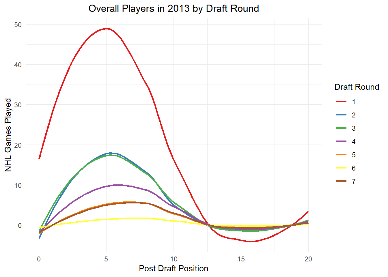
`geom_smooth()` using method = 'loess' and formula = 'y ~ x'
Figure 1: Representation of the overall players that were drafted in 2013. By looking at this line graph we can determine that the players drafted in Round 1 played the most NHL games compared from the other draft rounds. This indicates that players selected in the first round draft, are valuable players that can bring a lot winnings to the team. The NHL player Elias Lindholm was drafted in this year 2013 in the first round pick.
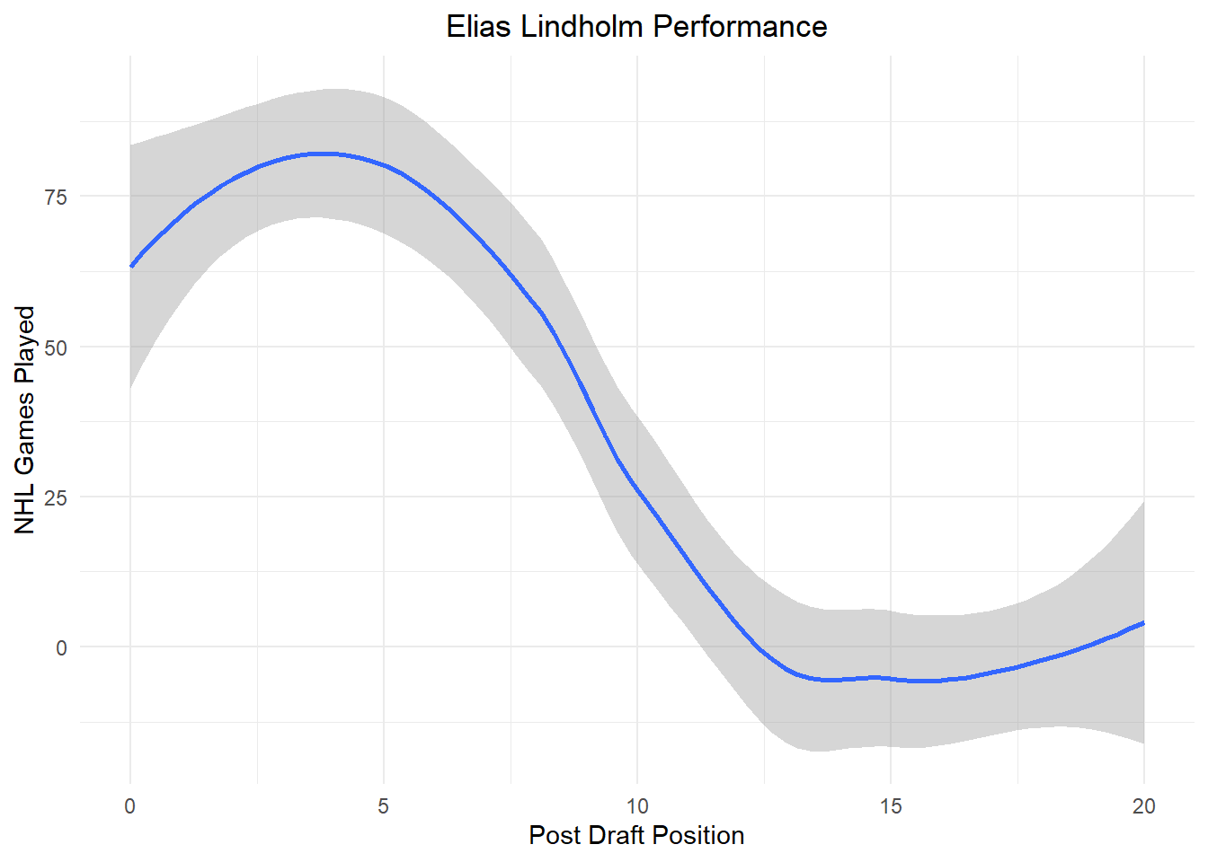
Elias Lindholm Performance
Since, we looked at the overall pick of players that were drafted in 2013, I wanted to look were Elias Lindholm performance lies post draft.
`geom_smooth()` using method = 'loess' and formula = 'y ~ x'
Figure 2: This line graph represent Elias Lindholm post draft, and we can see that at the beginning of being drafted has played a lot of NHL games, meaning that he is an outstanding player.
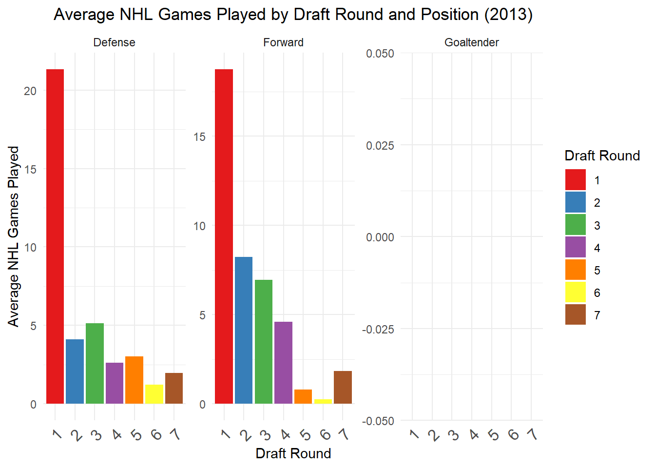
2013 Draft Pick by Positions
Elias Lindholm is in the forward position, I wanted to see how many players got drafted from the same position in contrast to the other positions.
Code
players_stats_2013 <- NHLdraftstats %>%filter(draftyear ==2013)library(dplyr)agg_data <- players_stats_2013 %>%group_by(round, position) %>%summarise(AvgNHLGames =mean(NHLgames, na.rm =TRUE), .groups ='drop')ggplot(agg_data, aes(x =factor(round), y = AvgNHLGames, fill =factor(round))) +geom_col() +facet_wrap(~position, scales ="free_y") +theme_minimal() +ggtitle("Average NHL Games Played by Draft Round and Position (2013)") +xlab("Draft Round") +ylab("Average NHL Games Played") +scale_fill_brewer(palette ="Set1", name ="Draft Round") +theme(plot.title =element_text(hjust =0.5),axis.text.x =element_text(angle =45, hjust =1, size =12))
Figure3: The following bar graphs are divided by position, by round and the average of NHL played games from the players that were drafted in 2013. By looking at this graphs we can say that the positions for forward and defense are highly drafted in the first round and are the ones that played the most in NHL games. The Goal Tender there’s no overall pick in this 2013 draft pick. Meaning that these two positions for defense and forward are the most highly looked for selecting players.
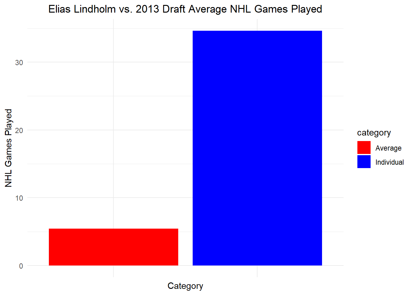
Elias Lindholm vs Drafted Players 2013 Performance
We now that Elias Lindholm has a good performance after being drafted. I wanted to compare with the other players that were also drafted on 2013. This will help me have a perspective why Calgary did the trade with Vancouver for him.
Code
players_stats_2013 <- NHLdraftstats %>%filter(draftyear ==2013)library(dplyr)library(ggplot2)# Calculate the average NHL games played by players other than Elias Lindholmaverage_games <- players_stats_2013 %>%filter(name !="Elias Lindholm") %>%summarise(average_NHL_games =mean(NHLgames, na.rm =TRUE))# Calculate Elias Lindholm's average NHL gameselias_avg_games <- players_stats_2013 %>%filter(name =="Elias Lindholm") %>%summarise(NHLgames =mean(NHLgames, na.rm =TRUE)) %>%mutate(name ="Elias Lindholm", category ="Individual")# Create a data frame for the draft averageaverage_df <-data.frame(name ="2013 Draft Average",NHLgames = average_games$average_NHL_games,category ="Average")# Ensure both data frames have the same structure and combine themcomparison_data <-rbind(elias_avg_games, average_df)# Create the bar graph comparing Elias Lindholm's NHL games played to the 2013 draft averageggplot(comparison_data, aes(x = name, y = NHLgames, fill = category)) +geom_col() +theme_minimal() +ggtitle("Elias Lindholm vs. 2013 Draft Average NHL Games Played") +xlab("Category") +ylab("NHL Games Played") +scale_fill_manual(values =c("Average"="red", "Individual"="blue")) +theme(plot.title =element_text(hjust =0.5), axis.text.x =element_blank())
Figure 4: In this bar graph is comparison between the performance of Elias Lindholm vs the drafted players of 2013. I took the average of the NHL games played of the drafted players (is the one label as average and the blue bar) and also the average for Elias’s performance (is the one label as individual and the red bar). By looking at this graph we can say that Elias’s performance is alot higher than the overall average of the players that were drafted at the same year as Elias.
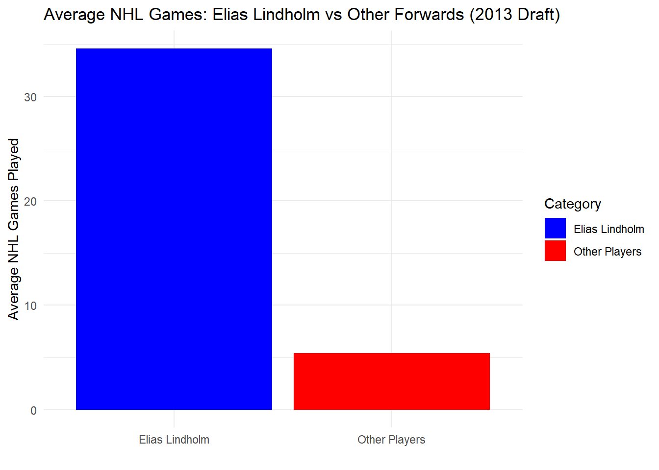
Elias Lindholm vs Forward Players (Drafted in 2013)
We now that Elias Lindholm has a good performance after being drafted compared to other players that were drafted on the same year. Now, I wanted to compare the performance with players that have the same position as Elias. This also, will give more insight the decision of the trade.
Code
forwards_2013 <- players_stats_2013 %>%filter(draftyear ==2013, position =="Forward") %>%select(name, position, NHLgames) library(dplyr)# Mark Elias Lindholm and other playersplayers_stats_2013 <- players_stats_2013 %>%mutate(Category =ifelse(name =="Elias Lindholm", "Elias Lindholm", "Other Players"))# Calculate average NHL games for Elias and other playersavg_games_comparison <- players_stats_2013 %>%group_by(Category) %>%summarise(AverageNHLGames =mean(NHLgames, na.rm =TRUE))# Plotggplot(avg_games_comparison, aes(x = Category, y = AverageNHLGames, fill = Category)) +geom_col() +theme_minimal() +ggtitle("Average NHL Games: Elias Lindholm vs Other Forwards (2013 Draft)") +xlab("") +ylab("Average NHL Games Played") +scale_fill_manual(values =c("Elias Lindholm"="blue", "Other Players"="red"))
Figure 4: In this bar graph is comparison between the performance of Elias Lindholm vs the players on the same position as forward. I took the average of the NHL games played of the drafted players (is the one label as Other Players) and also the average for Elias’s performance (Blue bar). By looking at this graph we can say that Elias’s performance is alot higher than the overall average of the players that were drafted at the same year as Elias in the postion as forward.
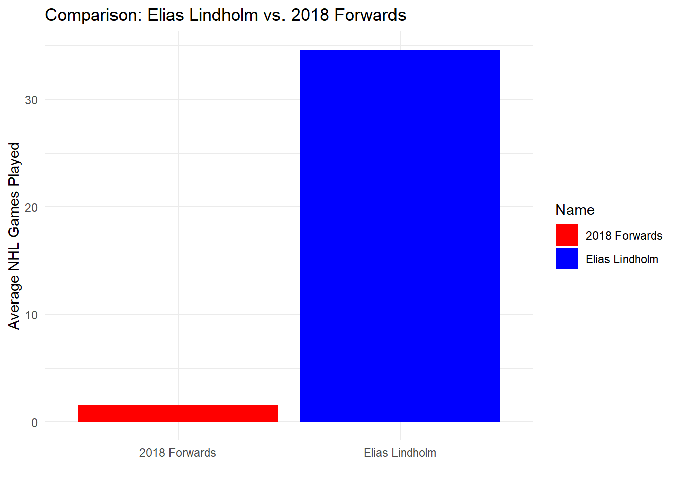
Elias Lindholm vs. Forwards (Drafted in 2018)
We now that Elias Lindholm has a good performance, now I wanted to compare its performance with forward players that were drafted in 2018. It is clear that Elias has more experience and has alot of exposure in playing alot of NHL games. I just wanted to see and compare their performances between the two variables. Like having an experience player is better than acquiring new players.
Code
library(dplyr)players_stats_2018 <- NHLdraftstats %>%filter(draftyear ==2018, position =="Forward") %>%select(name, position, NHLgames) library(dplyr)library(ggplot2)# Assuming Elias Lindholm is also a forward and you want his statselias_metric <- NHLdraftstats %>%filter(name =="Elias Lindholm", position =="Forward") %>%summarise(AverageNHLGames =mean(NHLgames, na.rm =TRUE))# Calculate the average NHL games for forwards drafted in 2018avg_2018_metric <- players_stats_2018 %>%filter(position =="Forward") %>%summarise(AverageNHLGames =mean(NHLgames, na.rm =TRUE))# Combine the data for comparisoncomparison_data <-rbind(data.frame(Name ="Elias Lindholm", Metric = elias_metric$AverageNHLGames),data.frame(Name ="2018 Forwards", Metric = avg_2018_metric$AverageNHLGames))# Plot the comparisonggplot(comparison_data, aes(x = Name, y = Metric, fill = Name)) +geom_col() +theme_minimal() +ggtitle("Comparison: Elias Lindholm vs. 2018 Forwards") +ylab("Average NHL Games Played") +xlab("") +scale_fill_manual(values =c("Elias Lindholm"="blue", "2018 Forwards"="red"))
Figure 5: In this bar graph is comparison between the performance of Elias Lindholm vs forward players drafted in 2018. I took the average of the NHL games played of the 2018 Forwards (Red Bar) and also the average for Elias’s performance (Blue bar). By looking at this graph we can say that Elias’s performance is alot higher than the overall average of the Forward players that were drafted in 2018. But, this is also due that Elias has alot more experience than the players drafted in 2018.
CONCLUSION
Based on my visualizations, I think the Vancouver Canucks got a good trade with Elias Lindholm. He’s a solid forward based on the comparison data of other players in the same position in the same draft year; Elias Lindholm is a player in another league. Maybe, the reason that the Canucks made the trade with the Calgary Flames; is that they needed a player that could bring them the win of the Stanley Cup. The Canucks are thinking about their current gaming plan; and not too much about the future. Maybe the Calgary Flames wanted new players to improve their gaming strategies, and have a solid team for the future NHL games.
Source Code
---title: "Hockey Analytics"subtitle: "Visualizations for Tabular Data"author: "Geraline Trossi-Torres"date: "2024-02-29"categories: [Assignment, DataViz, Visualization]image: "Profile3.jpg"code-fold: truecode-tools: truedescription: "Lets learn about hockey draft analytics"---## OVERVIEWIn this assignment, we are going to practice creating visualizations for tabular data. Unlike previous assignments, however, this time we will all be using the same data sets. I'm doing this because I want everyone to engage in the same logic process and have the same design objectives in mind.## LEARNING OBJECTIVES1. Demonstrate that you can manipulate tabular data to facilitate different visualization tasks. The minimum skills are FILTERING, SELECTING, and SUMMARIZING, all while GROUPING these operations as dictated by your data.2. Demonstrate that you can use tabular data to explore, analyze, and choose the most appropriate visualization idioms given a specific motivating question.3. Demonstrate that you can Find, Access, and Integrate additional data in order to fully address the motivating question.The scenario below will allow you to complete the assignment. It deals with data that are of the appropriate complexity and extent (number of observations and variables) to challenge you. If you want to use different data (yours or from another source) I am happy to work with you to make that happen!## SCENARIOImagine you are a high priced data science consultant. One of your good friends, Cassandra Canuck, is an Assistant General Manager for the Vancouver Canucks, a team in the National Hockey League with a long, long.... long history of futility.This season feels different.The Canucks are currently among the league leaders and appear to be on their way to their first playoff appearance in many years. A few weeks ago, the Vancouver Canucks decided to trade an underperforming player with a high upside and their first round draft pick to the Calgary Flames for Elias Lindholm, a very solid forward that might prove to be the missing piece of their Stanley Cup puzzle. Exciting!Except that now the Canucks are struggling. They've lost 4 straight games and have seemingly lost their identity as a team. The fans are questioning whether the trade was worth it. Woe is me!For the purposes of this exercise, let's set the 2024 NHL draft order using the [Tankathon Simulator](https://www.tankathon.com/nhl). The NHL uses a lottery system in which the teams lowest in the standings have the highest odds of getting the first overall pick. This year the Canucks are at the top of the league, and positioned to have the 31st overall pick. According to the simulator, Calgary will pick at number 2 (which is very valuable!), and the Canuck's pick at 31.Here is a screenshot: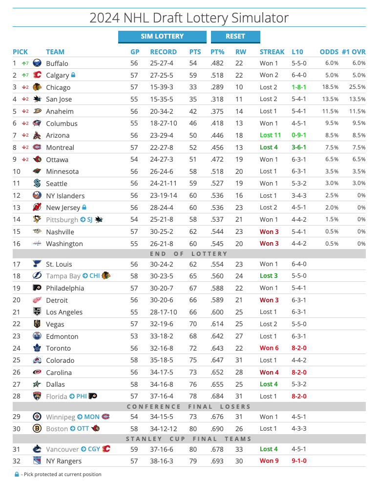### Here is the question:Was the trade worth it? This trade has a high likelihood of becoming what we call a **rental**. Elias Lindholm is on an expiring contract, meaning Vancouver is guaranteed to hold his contract only through the end of the season. They might be able to extend him, but that depends on the salary cap.Meanwhile, Calgary can draft a player at position 31, who may or may not turn out to be of equal or greater value than Lindholm.Was the trade worth it? Did Vancouver or Calgary "win" the trade?Can we make some visualizations that help us answer this question?[Here is an article](https://puckpedia.com/PerriPickValue) on modeling draft pick value[Eric Tulsky's original paper\*](https://www.broadstreethockey.com/post/nhl-draft-pick-value-trading-up/)## DIRECTIONSCreate a new post in your portfolio for this assignment. Call it something cool, like NHL draft analysis, or Hockey Analytics, or John Wick....Copy the data files from the repository, and maybe also the .qmd file.Use the .qmd file as the backbone of your assignment, changing the code and the markdown text as you go.## THE DATAHow can we evaluate whether trading a first round pick for a rental player is a good idea? One approach is to look at the historical performance of players from various draft positions.I've created a data set that will allow us to explore player performance as a function of draft position. If you are curious as to how I obtained and re-arranged these data, you can check out that tutorial [here](../T6-APIsandJSON/index.qmd). For this assignment, though, I want to focus on the visualizations.```{r include=FALSE}library(tidyverse)library(dplyr)library(ggplot2)library(readxl)``````{r}NHLDraft<-read.csv("NHLDraft.csv")NHLDictionary<-read_excel("NHLDictionary.xlsx")knitr::kable(NHLDictionary)```In this case, we have a dataframe with all the drafted players from 2000-2018, their position, their draft year and position, and then rows for each season since being drafted (`postdraft`). The key variable here is `NHLgames`, which tells us how many games they played in the NHL each season since being drafted. Whether drafted players even make the NHL, and how many games they play, might be a good proxy to understand the value of a draft pick we just traded away.::: callout-note## HINTIn the GitHub repository there is a file called `NHLdraftstats.csv`. What's in there? Can we use that information?:::## ANALYTICS REGARDING IF THE TRADE WAS WORTH IT### 2013 Draft Picks```{r}NHLdraftstats <-read.csv("NHLdraftstats.csv")library(dplyr)players_stats_2013_2 <- NHLdraftstats %>%filter(draftyear ==2013) %>%filter(name !="Elias Lindholm")ggplot(players_stats_2013_2, aes(x=postdraft, y=NHLgames, color=as.factor(round))) +geom_smooth(se=FALSE) +theme_minimal() +ggtitle("Overall Players in 2013 by Draft Round") +xlab("Post Draft Position") +ylab("NHL Games Played") +theme(plot.title =element_text(hjust =0.5)) +scale_color_brewer(palette="Set1", name="Draft Round")```**Figure 1:** Representation of the overall players that were drafted in 2013. By looking at this line graph we can determine that the players drafted in Round 1 played the most NHL games compared from the other draft rounds. This indicates that players selected in the first round draft, are valuable players that can bring a lot winnings to the team. The NHL player Elias Lindholm was drafted in this year 2013 in the first round pick. ### Elias Lindholm PerformanceSince, we looked at the overall pick of players that were drafted in 2013, I wanted to look were Elias Lindholm performance lies post draft.```{r}library(dplyr)library(ggplot2)NHLdraftstats <-read.csv("NHLdraftstats.csv")Elias_stats <- NHLdraftstats %>%filter(name =="Elias Lindholm")ggplot(Elias_stats, aes(x=postdraft, y=NHLgames)) +geom_smooth() +theme_minimal() +ggtitle("Elias Lindholm Performance") +xlab("Post Draft Position") +ylab("NHL Games Played") +theme(plot.title =element_text(hjust =0.5))```**Figure 2:** This line graph represent Elias Lindholm post draft, and we can see that at the beginning of being drafted has played a lot of NHL games, meaning that he is an outstanding player.### 2013 Draft Pick by PositionsElias Lindholm is in the forward position, I wanted to see how many players got drafted from the same position in contrast to the other positions.```{r}players_stats_2013 <- NHLdraftstats %>%filter(draftyear ==2013)library(dplyr)agg_data <- players_stats_2013 %>%group_by(round, position) %>%summarise(AvgNHLGames =mean(NHLgames, na.rm =TRUE), .groups ='drop')ggplot(agg_data, aes(x =factor(round), y = AvgNHLGames, fill =factor(round))) +geom_col() +facet_wrap(~position, scales ="free_y") +theme_minimal() +ggtitle("Average NHL Games Played by Draft Round and Position (2013)") +xlab("Draft Round") +ylab("Average NHL Games Played") +scale_fill_brewer(palette ="Set1", name ="Draft Round") +theme(plot.title =element_text(hjust =0.5),axis.text.x =element_text(angle =45, hjust =1, size =12))```**Figure3:** The following bar graphs are divided by position, by round and the average of NHL played games from the players that were drafted in 2013. By looking at this graphs we can say that the positions for forward and defense are highly drafted in the first round and are the ones that played the most in NHL games. The Goal Tender there's no overall pick in this 2013 draft pick. Meaning that these two positions for defense and forward are the most highly looked for selecting players.### Elias Lindholm vs Drafted Players 2013 PerformanceWe now that Elias Lindholm has a good performance after being drafted. I wanted to compare with the other players that were also drafted on 2013. This will help me have a perspective why Calgary did the trade with Vancouver for him. ```{r}players_stats_2013 <- NHLdraftstats %>%filter(draftyear ==2013)library(dplyr)library(ggplot2)# Calculate the average NHL games played by players other than Elias Lindholmaverage_games <- players_stats_2013 %>%filter(name !="Elias Lindholm") %>%summarise(average_NHL_games =mean(NHLgames, na.rm =TRUE))# Calculate Elias Lindholm's average NHL gameselias_avg_games <- players_stats_2013 %>%filter(name =="Elias Lindholm") %>%summarise(NHLgames =mean(NHLgames, na.rm =TRUE)) %>%mutate(name ="Elias Lindholm", category ="Individual")# Create a data frame for the draft averageaverage_df <-data.frame(name ="2013 Draft Average",NHLgames = average_games$average_NHL_games,category ="Average")# Ensure both data frames have the same structure and combine themcomparison_data <-rbind(elias_avg_games, average_df)# Create the bar graph comparing Elias Lindholm's NHL games played to the 2013 draft averageggplot(comparison_data, aes(x = name, y = NHLgames, fill = category)) +geom_col() +theme_minimal() +ggtitle("Elias Lindholm vs. 2013 Draft Average NHL Games Played") +xlab("Category") +ylab("NHL Games Played") +scale_fill_manual(values =c("Average"="red", "Individual"="blue")) +theme(plot.title =element_text(hjust =0.5), axis.text.x =element_blank())```**Figure 4:** In this bar graph is comparison between the performance of Elias Lindholm vs the drafted players of 2013. I took the average of the NHL games played of the drafted players (is the one label as average and the blue bar) and also the average for Elias's performance (is the one label as individual and the red bar). By looking at this graph we can say that Elias's performance is alot higher than the overall average of the players that were drafted at the same year as Elias.### Elias Lindholm vs Forward Players (Drafted in 2013)We now that Elias Lindholm has a good performance after being drafted compared to other players that were drafted on the same year. Now, I wanted to compare the performance with players that have the same position as Elias. This also, will give more insight the decision of the trade. ```{r}forwards_2013 <- players_stats_2013 %>%filter(draftyear ==2013, position =="Forward") %>%select(name, position, NHLgames) library(dplyr)# Mark Elias Lindholm and other playersplayers_stats_2013 <- players_stats_2013 %>%mutate(Category =ifelse(name =="Elias Lindholm", "Elias Lindholm", "Other Players"))# Calculate average NHL games for Elias and other playersavg_games_comparison <- players_stats_2013 %>%group_by(Category) %>%summarise(AverageNHLGames =mean(NHLgames, na.rm =TRUE))# Plotggplot(avg_games_comparison, aes(x = Category, y = AverageNHLGames, fill = Category)) +geom_col() +theme_minimal() +ggtitle("Average NHL Games: Elias Lindholm vs Other Forwards (2013 Draft)") +xlab("") +ylab("Average NHL Games Played") +scale_fill_manual(values =c("Elias Lindholm"="blue", "Other Players"="red"))```**Figure 4:** In this bar graph is comparison between the performance of Elias Lindholm vs the players on the same position as forward. I took the average of the NHL games played of the drafted players (is the one label as Other Players) and also the average for Elias's performance (Blue bar). By looking at this graph we can say that Elias's performance is alot higher than the overall average of the players that were drafted at the same year as Elias in the postion as forward.### Elias Lindholm vs. Forwards (Drafted in 2018)We now that Elias Lindholm has a good performance, now I wanted to compare its performance with forward players that were drafted in 2018. It is clear that Elias has more experience and has alot of exposure in playing alot of NHL games. I just wanted to see and compare their performances between the two variables. Like having an experience player is better than acquiring new players. ```{r}library(dplyr)players_stats_2018 <- NHLdraftstats %>%filter(draftyear ==2018, position =="Forward") %>%select(name, position, NHLgames) library(dplyr)library(ggplot2)# Assuming Elias Lindholm is also a forward and you want his statselias_metric <- NHLdraftstats %>%filter(name =="Elias Lindholm", position =="Forward") %>%summarise(AverageNHLGames =mean(NHLgames, na.rm =TRUE))# Calculate the average NHL games for forwards drafted in 2018avg_2018_metric <- players_stats_2018 %>%filter(position =="Forward") %>%summarise(AverageNHLGames =mean(NHLgames, na.rm =TRUE))# Combine the data for comparisoncomparison_data <-rbind(data.frame(Name ="Elias Lindholm", Metric = elias_metric$AverageNHLGames),data.frame(Name ="2018 Forwards", Metric = avg_2018_metric$AverageNHLGames))# Plot the comparisonggplot(comparison_data, aes(x = Name, y = Metric, fill = Name)) +geom_col() +theme_minimal() +ggtitle("Comparison: Elias Lindholm vs. 2018 Forwards") +ylab("Average NHL Games Played") +xlab("") +scale_fill_manual(values =c("Elias Lindholm"="blue", "2018 Forwards"="red"))```**Figure 5:** In this bar graph is comparison between the performance of Elias Lindholm vs forward players drafted in 2018. I took the average of the NHL games played of the 2018 Forwards (Red Bar) and also the average for Elias's performance (Blue bar). By looking at this graph we can say that Elias's performance is alot higher than the overall average of the Forward players that were drafted in 2018. But, this is also due that Elias has alot more experience than the players drafted in 2018.## CONCLUSIONBased on my visualizations, I think the Vancouver Canucks got a good trade with Elias Lindholm. He's a solid forward based on the comparison data of other players in the same position in the same draft year; Elias Lindholm is a player in another league. Maybe, the reason that the Canucks made the trade with the Calgary Flames; is that they needed a player that could bring them the win of the Stanley Cup. The Canucks are thinking about their current gaming plan; and not too much about the future. Maybe the Calgary Flames wanted new players to improve their gaming strategies, and have a solid team for the future NHL games.